fkfd.me
First published 2023-11-27
Latest version 2023-11-27
Yes — the inevitable "How I built my blog" blogpost! Except it's like the 44th post, and hey, at least it's not Jekyll or Hexo or WordPress (no offense).
Early history (2020)
fkfd.me
I bought the domain fkfd.me on 2020-02-14 for 20.98 USD, after my previous domain, autometalogolex.me expired.
fkfd.me was for my comics initially; my blog was hosted on blog.fkfd.me.
The meaning behind fkfd
fkfd is a contraction of fakefred.
fakefred, which happens to be my GitHub username, stems from the facts that (a) I go by the English name Frederick and (b) there was an "X might be fake" internet meme in mainland China.
In retrospect, fkfd is a genuinely high-quality name. All four letters are in the QWERTY home row. And I'm glad I didn't go for fakefred.me because that would be cringe.
First design
The first git commit was made on 2020-04-23.
I opted for MkDocs as the static site generator, forked the alabaster theme, and called it alabaster-lite. I disabled all JavaScript, kicked out all the clutter, and left this masterpiece:
Background color
If you are reading in dark theme, you'll notice that the background color
hasn't changed at all. It is #19202b.
Why this particular color? I don't know. Probably forgot. No comment in the CSS either. This kind of shit is why I keep a blog, to archive my motivations.
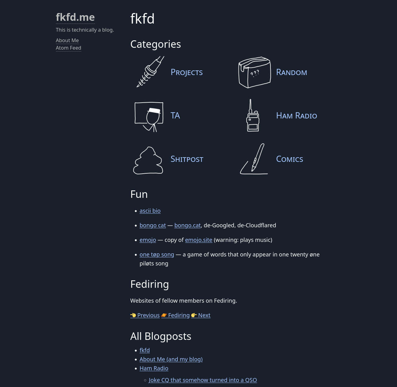
Then it was like this for one year and a half (2022)
Per git log, the next big update was in 2022-01-07. I graduated high
school, and began to use fkfd.me as a legit blog, moving comics to
fkfd.me/comics. I also reorganized all past blogposts (like 7 at the time)
into categories (projects, random, shitpost).
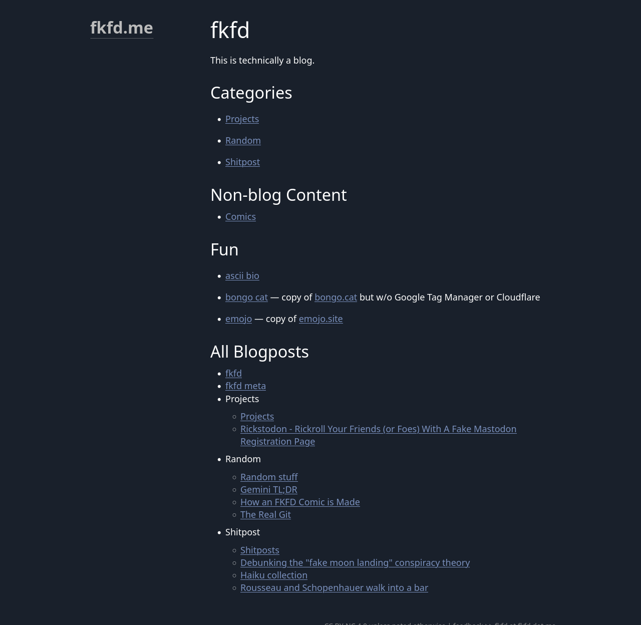
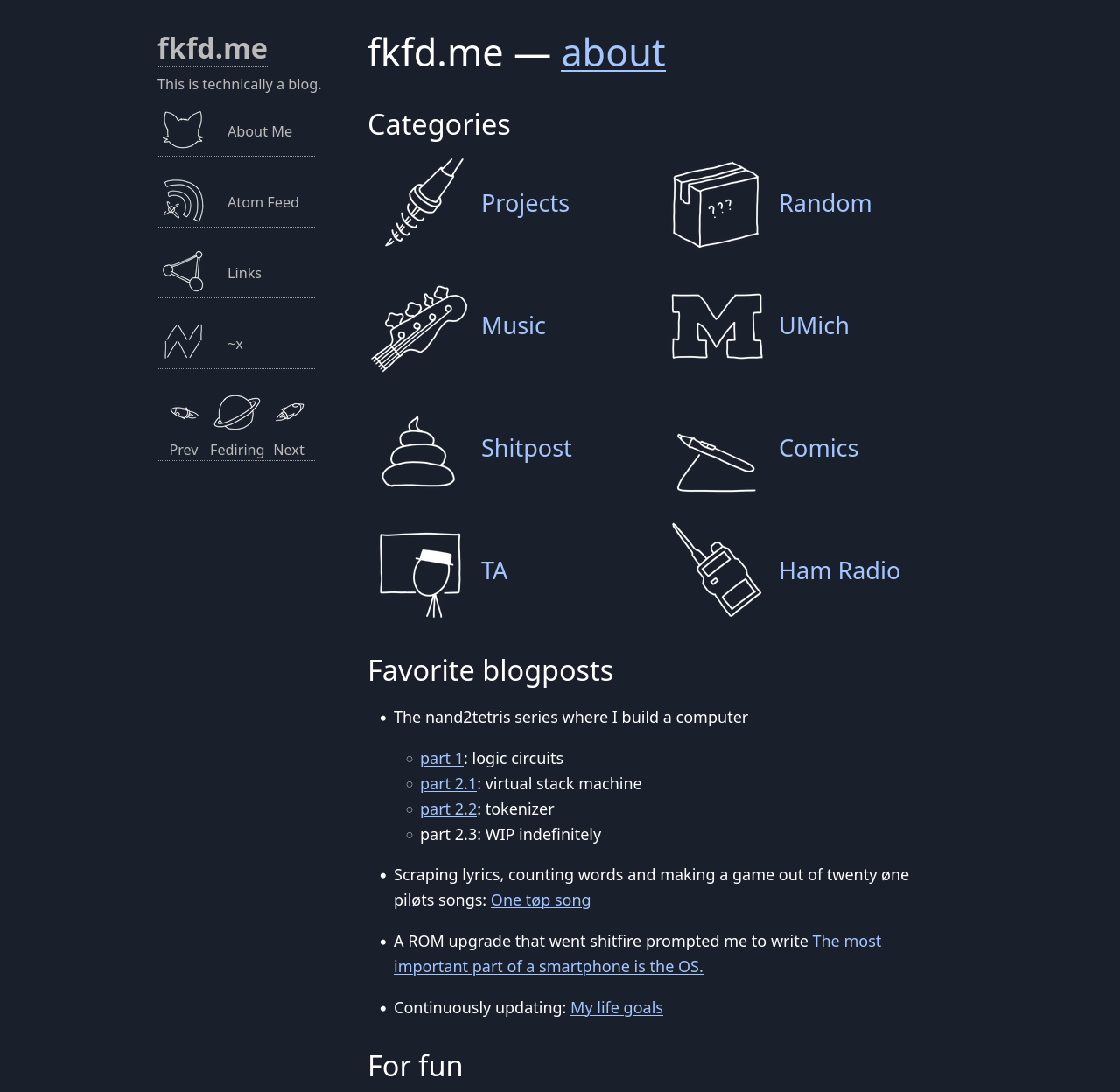
Categories
Two days later I did a major redesign on the homepage.
A few months later I joined Fediring and increased the line spacing. But apart from that not so much changed.
Fast forward 7 months (2022-2023)
Bad design. Just no
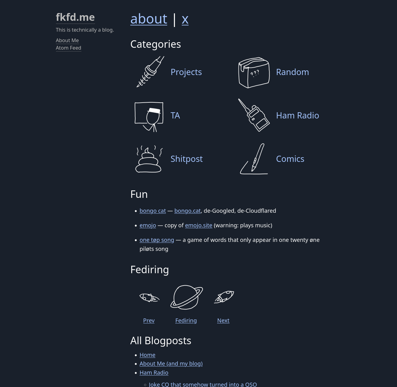
On 2022-12-28 I was at home with covid. It really messes with your head. Which explains this absolute disaster of a design:
It would have looked great, if my theme was more vibrant, which it is not.
Effort, however, is not wasted. The grid layout has been reused ever since.
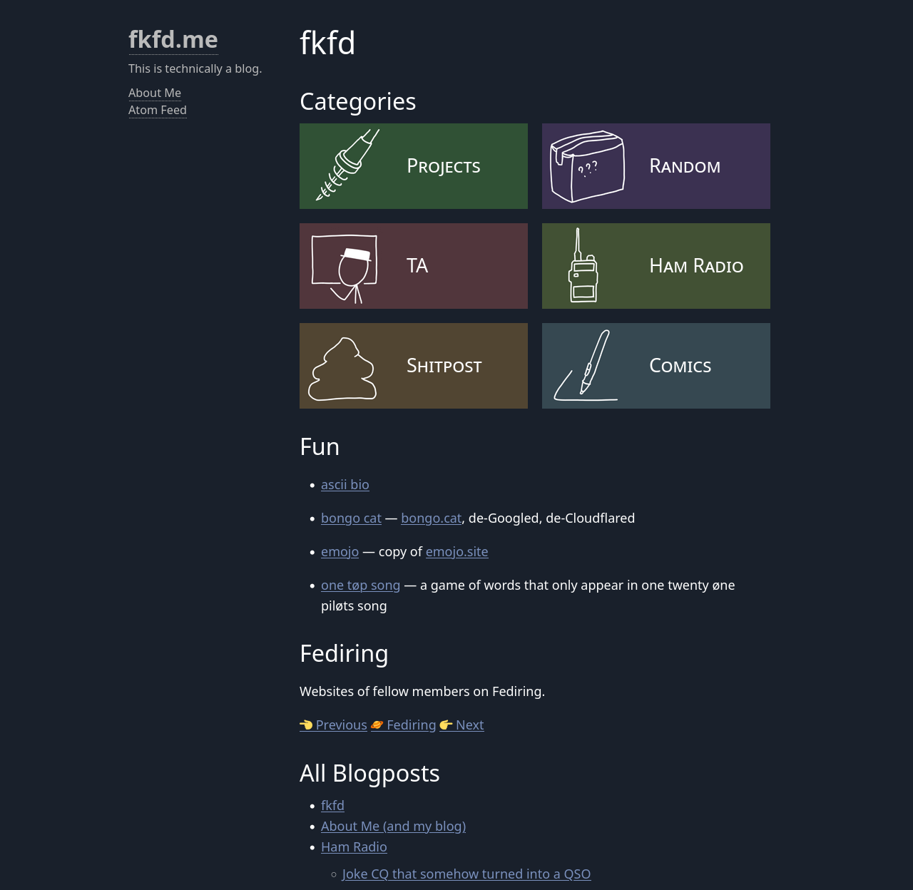
Much better
Half a month later, 2023-01-15:
Two days later:
About Me
I also included my About Me page in the heading, because I find it the most useful page when I'm visiting someone else's blog. What's interesting about you? What do you enjoy? What do we have in common? If it warrants a whole ass page, it deserves a heading unto itself.
Another 7 months (2023)
New categories
In summer 2023 I flew to the US to study at U of Michigan, thus the UMich category. There was only one music post, initially in Projects (namely Early Sunsets Over Monroeville), but I did anticipate more coming in the future, so I made it a category of its own. Turns out a great decision because of This Song Will Uncure Your Depression.
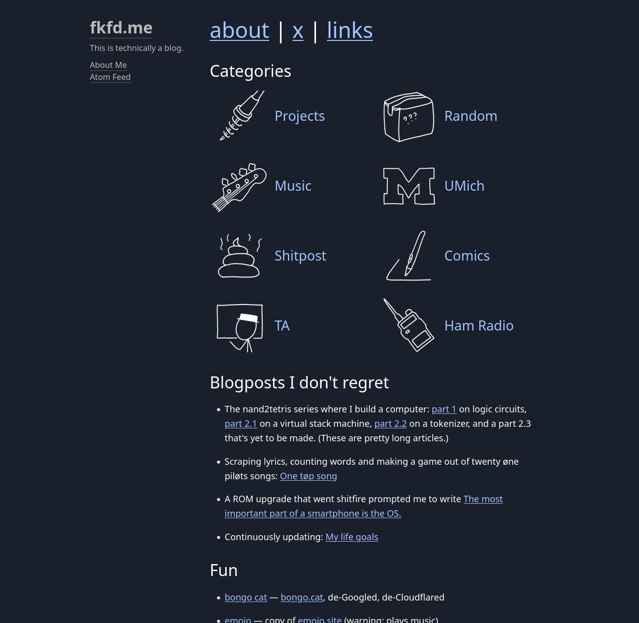
Blogposts I don't regret
The "Blogposts I don't regret" section was actually added in Janurary too. I didn't include it in my screenshot because then you won't be able to see my Fediring icons 🪐🚀
It was a compromise between "Featured blogposts" (narcissist) and "Blogposts that don't suck" (self-deprecating). I don't care about your opinion. I find them representative of my style, and thus good "entry points" for a new visitor.
Accessibility
Around this time I grew more and more accessibility-aware. A few problems were fixed, such as text contrast and heading levels.
This is not the right vibe
I've visited dozens of personal websites, but few do I consider "excellent". An "excellent" website is consistent in content and style, but manages to surprise me.
For example, maia crimew's website delivers all its promises:
- soft kitten
- disregard of authority
- gay
It lowkey disappoints me when someone's website fails to capture their energy. I feel like if you are gay, a furry, a pirate, or a gay furry pirate, you most certainly deserve a decent website to show off that energy. Not that techbro-style boilerplate.
Unfortunately, my blog falls right into this category. As a remedy, I would try to add an essential element of any good website:
Cat.
Thus on 2023-11-05:
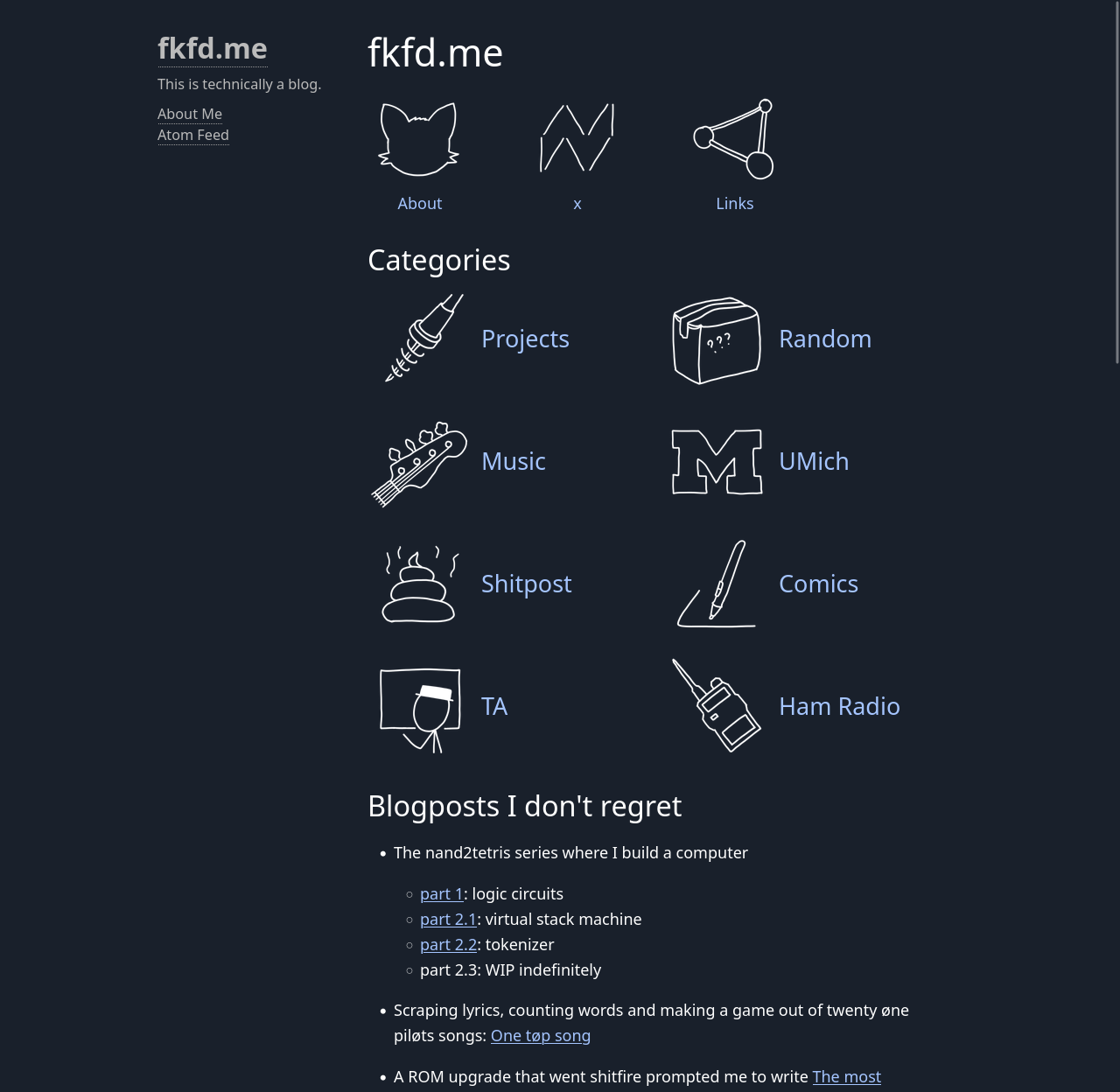
It is a link to my About Me page, which does mention my affinity to cats.
A more subdued approach
At this point, there are three sets of icons on my homepage:
- header icons (about, x, links)
- categories
- fediring
Categories are supposed to be the focus, and the other two are stealing it. Also it looks terrible on mobile. Not good. I reverted the design only one week later.
But the assets were still there. Plus, I really liked the cat icon. Meanwhile the sidebar is mostly empty. And there we go!
Hover
I also made alternative icons for the categories that appear on hover. The problem is that, the browser does not prefetch them, and they flicker for a few milliseconds on the first hover. I can't find any non-hacky way to fix it.